Muse

BrightSites - Mobile Screens
BrightSites Framer Website
BrightSites - Tablet Screens

Category:

Mobile and Web Design

Company:

Design Sprint Case Study

Duration:

2 weeks

What is Muse?

A startup company has launched a music player available on both web and mobile platforms, compatible with iOS and Android devices. The company’s strategy was to build a user base by offering a free product and then monetize the free product on a  premium (paid) model. At this point the product has been well received and has a healthy user base of free users. The company now wants to convert free users into paid users.

Bonus context: This is a solo design project.

Problem

How to monetize the free product and convert free users to premium (paid) model?

Solution

The solution can be divided into two key parts:

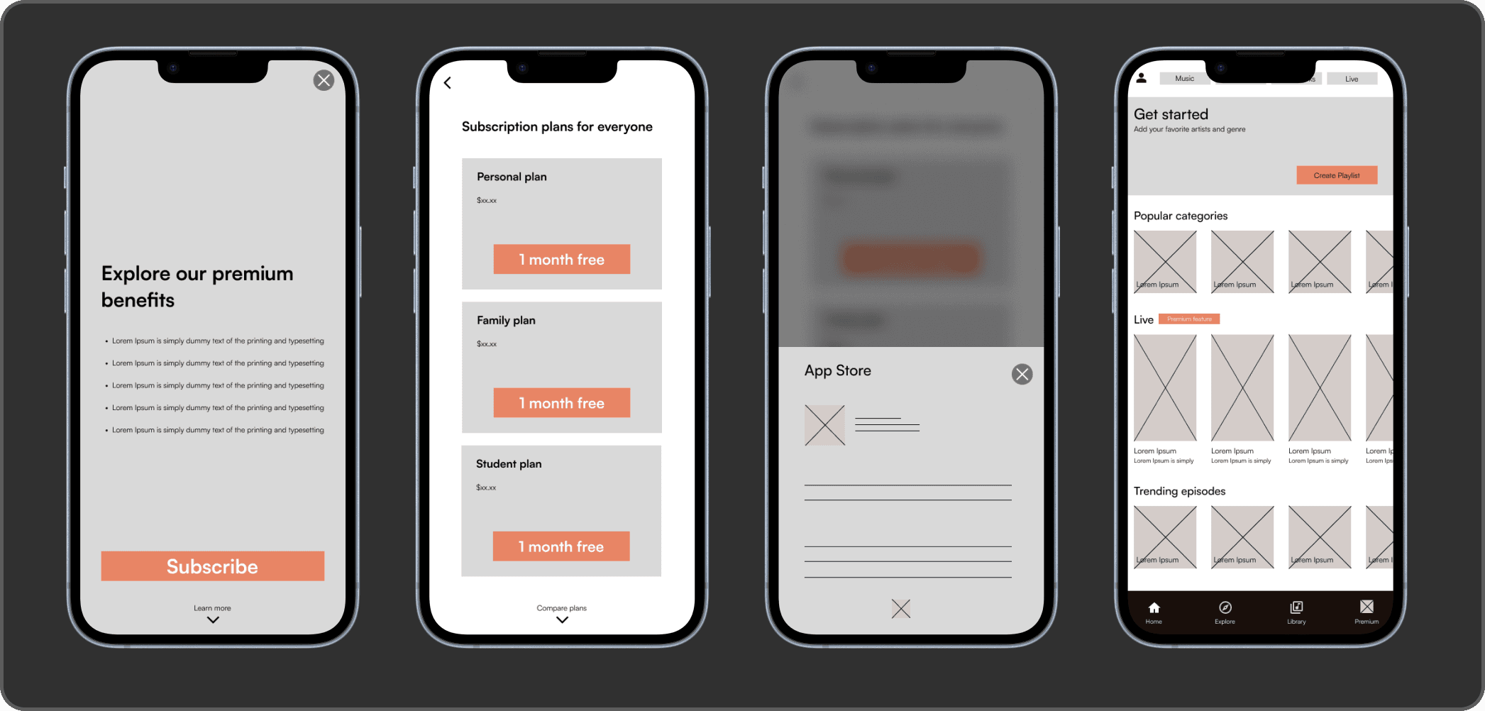
  1. Allow users to subscribe to a premium model of the app during the sign up/sign in user flow.

  2. Create opportunities for users to subscribe to the premium model of the app through the free model.

Identifying Unique Challenges

Time constraint:
  • Two weeks to design the solution.

Mapping the Design Process

  1. Research on existing similar media platforms.

  2. User flows

  3. Sketching

  4. Wireframes

  5. Prototype

Research

I utilized various research techniques to gather initial information for the design process. While user interviews would have been ideal during this phase, time constraints required me to work with the available data.

Research Methods: Conducted SWOT analysis, created artboards, and performed competitive analysis to inform the design process.

Visualization

User Flows

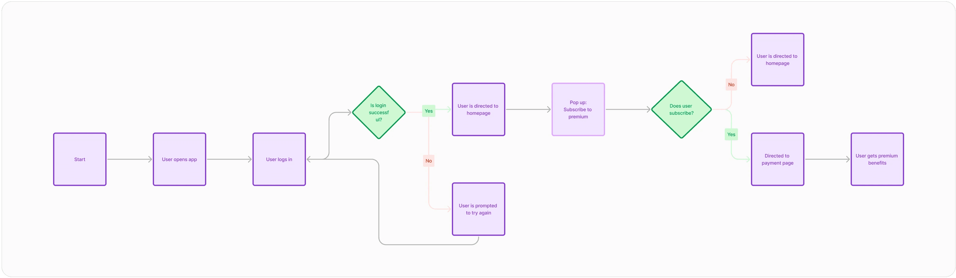
Sign up/sign in flow

Sketches

Onboarding Process

Wireframes

Prototype

Redesigned the color scheme to align with the brand's guidelines, aiming for a look that is "uniquely diverse yet familiar" while embodying boldness, intelligence, and a modern vibe.

Testing

Objectives:

  1. Are users completing user flows as intended?

  2. Are there any important missing features?

  3. How will users interact with current features?

Results:

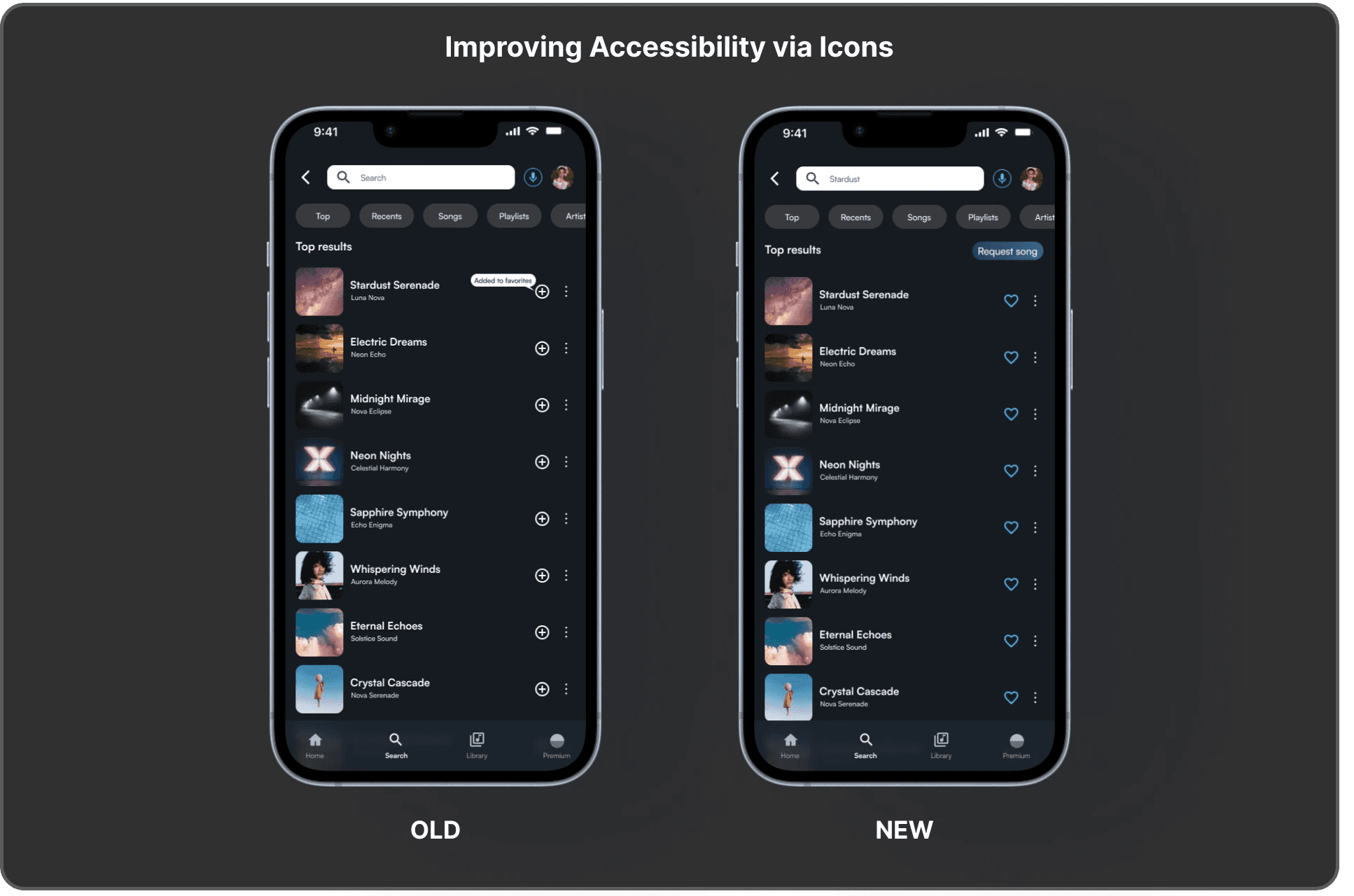
  1. Missing Features: The 'create playlist' option was absent in the 'library' section.

  2. Banner Blindness: Most users overlooked the 'create playlist' banner CTA.

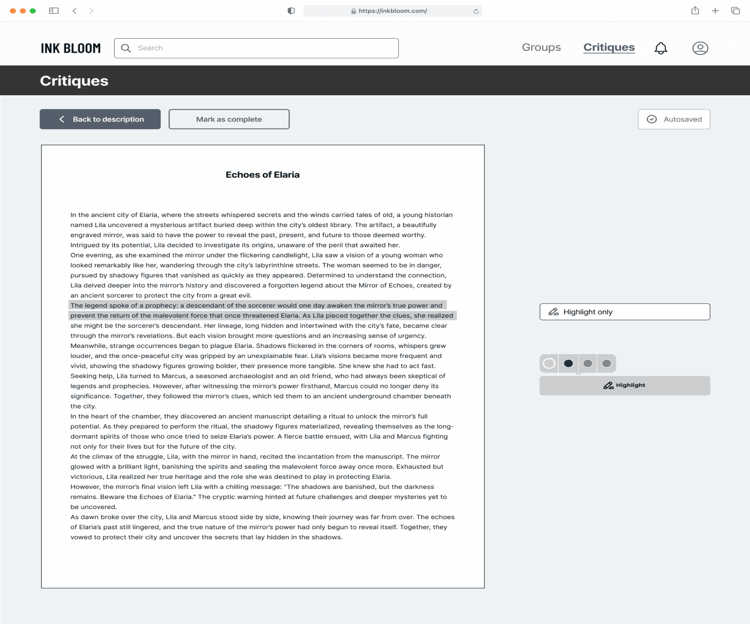
  3. Confusing Language: Some users reported confusion when navigating parts of the prototype.

Extra insights:

  • Most users are more likely to subscribe to the premium service based on music selection rather than features. This suggests that the business should prioritize music licensing efforts.

Example

Next Steps

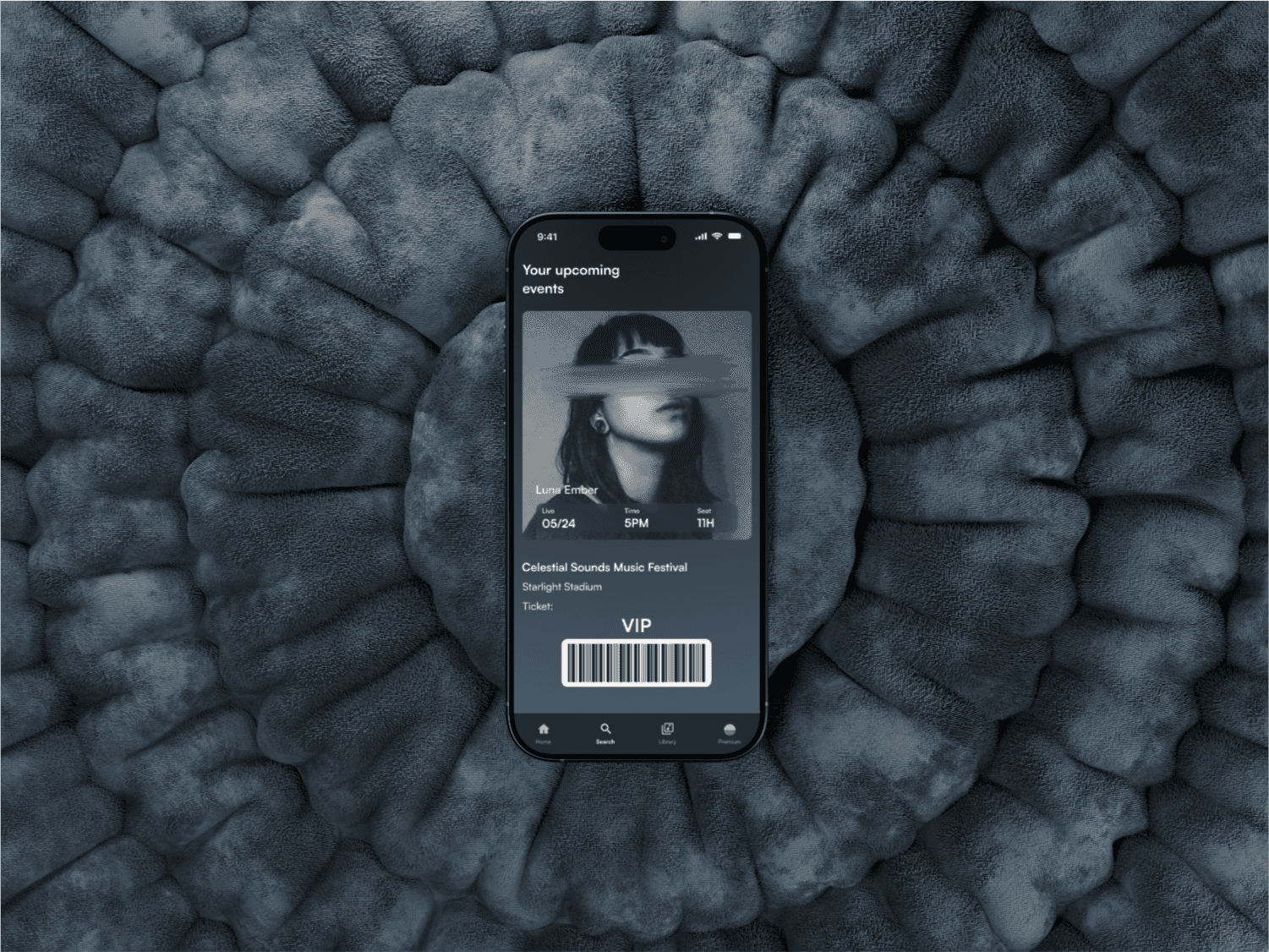
  • Enhance Live Events Feature: Improve aspects like the ticket purchasing process.

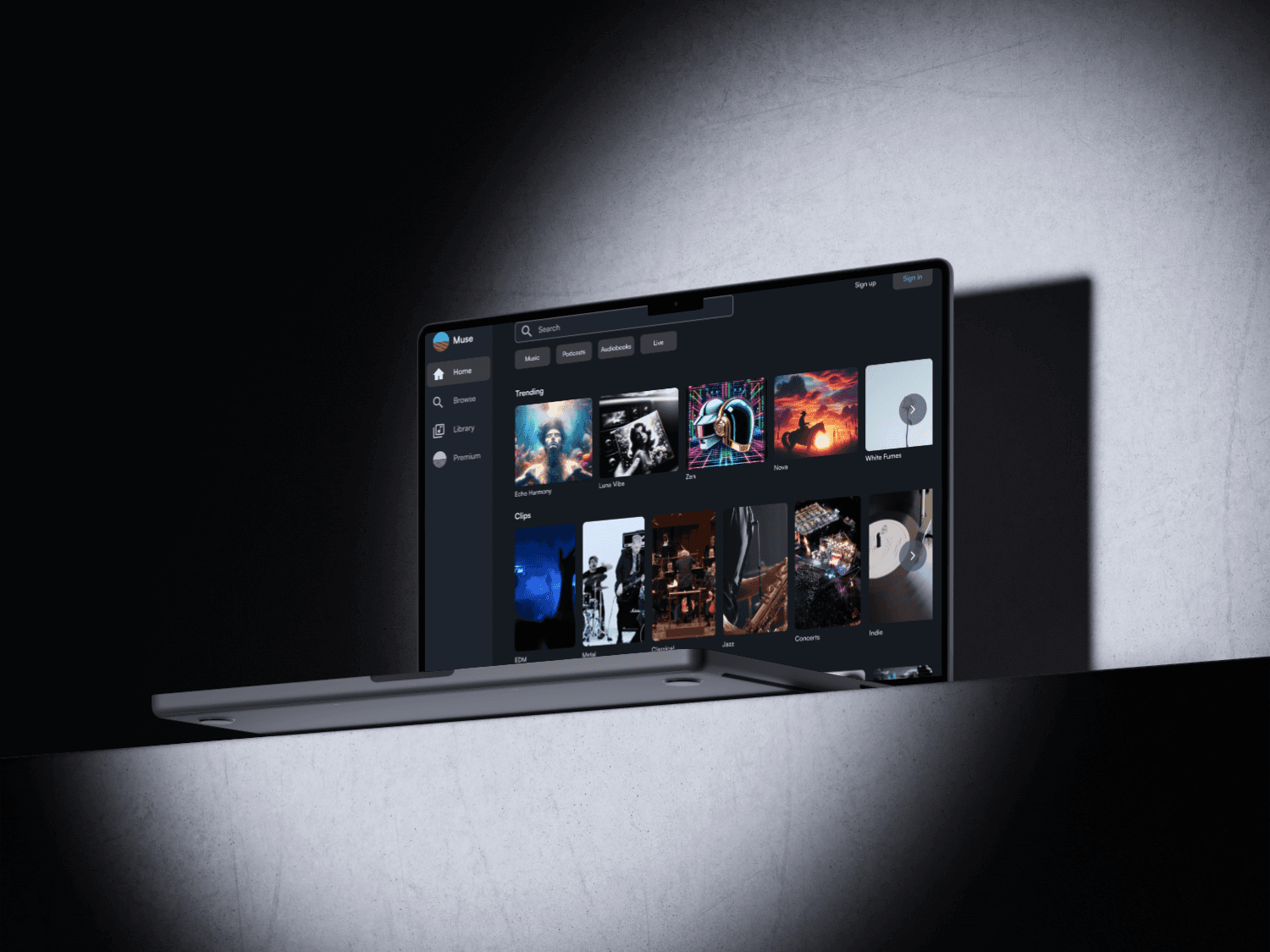
  • Further Iterate on Web Version: Continue refining and optimizing the web design.
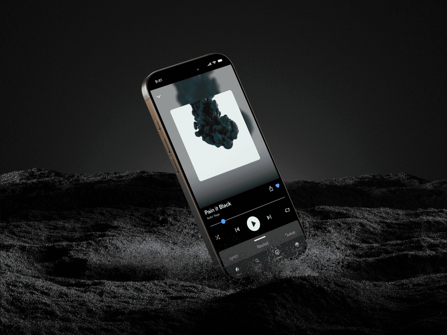

Final Prototypes

Mobile


Web


What I learned

  • SWOT Analysis

  • COMP Analysis

  • Artboards

  • A/B Testing

Summary

Goal:

  • Convert free users to premium users and figure out a way to monetize free version.

Constraints:

  • Time: With two weeks I had to carefully plan out the amount of time I had for research, wireframes, user interviews, and prototyping.

Overall:

  • Was able to deliver a high-fidelity mobile prototype and design the onboarding process for web.


Thank you for reading my case study!

(P.S. There's more to explore below!)

Macbook Pro

Macbook Pro

Jason Xin

Ink Bloom

Product Overview

Ink Bloom was crafted to empower writers in achieving their goals, whether they're professionals striving for publication or hobbyists refining their skills. Writers can upload their work for critique, engage in discussions, and connect with a community of fellow writers. The platform fosters a collaborative space to hone craft, share inspiration, and celebrate a shared passion for writing.

Contract Duration

Jun 1 2024 - Jun 30 2024 (1 month)

Tools

Goal

The goal of these testing sessions is to evaluate the clarity and efficiency of our new user flows and low-fidelity prototype, identify any inconsistencies or critical issues, assess the effectiveness of the updated information architecture, and understand what users now value most about the platform

Overview

Our results can be measured on a scale from critical, major, minor, and normal.

Users struggle to engage effectively on a mobile-centric platform, as recent research shows a clear preference for a web-based experience that offers better accessibility and functionality.

Problem Statement

Heuristic Analysis and Survey of Previous Design

Conduct a heuristic analysis and user interviews of the previous design to identify usability issues, and bring any questions or concerns to the client for clarification and improvement.

Focus on Web Design

Following discussions with the client, we agreed to prioritize a web-first design approach to better align with user preferences and platform goals.

Create a Web Based High-Fidelity Prototype

Develop a high-fidelity web-based prototype, shifting from a mobile-centric approach after user surveys revealed a strong preference for a web platform.

Objective & Goals

My Process

Design Thinking Process

Empathize

Define

Ideate

Design

Test

Phase #1

*

Phase #1

*

Phase #1

Empathize

Phase #2

*

Phase #2

*

Phase #2

Define

Phase #3

*

Phase #3

*

Phase #3

Ideate

Duration: 15 Sep 2023 - 22 Sep 2023 (1 Week)

End User

Our target Audience is the Age of 18 - 60 writers.

Request Feedback User Flow

Feedback

Give Feedback

Request Feedback

User uses search bar

Selects a user

User’s profile

Request feedback

List of users

View Past Feedback

Start

Home Page

Yes

No

We conducted user interviews with approximately 10 participants to gain insights into their experiences with the current prototype. This research aimed to identify any pain points or frustrations and to determine whether users prefer a mobile or web-based platform.

Qualitative Research

Yes

No

Percentage of writers who expressed a preference for a web platform over a mobile platform

What do features do writers value the most?

Writers love the community aspect of the platform.

They appreciate receiving feedback directly from other users.

Many are also interested in mentorship opportunities with industry professionals.

Confusing web layout: UI elements were inconsistently placed, making them difficult to understand and navigate.

The hamburger menu concealed many important features, making them harder for users to find.

Users showed a clear preference for the web platform over the mobile version.

User Pain Points

Empathy Map

Says

I need a community of writers to help me improve my craft.

I want feedback from other experienced writers.

The writing profession often feels isolating and lonely.

I wish I could gather more insights to refine my writing.

Thinks

Can this platform help me find a supportive community?

I’m hoping to connect with like-minded individuals

Will the feedback quality on this platform meet my expectations and needs?

Feels

Eager to connect with like-minded individuals and share ideas.

Feels isolated due to the solitary nature of the writing profession.

Optimistic about receiving valuable feedback on her work.

Desires a user-friendly platform that doesn’t require advanced technical skills.

Does

Seeks constructive feedback to improve her writing.

Shares drafts with friends, family, and her publisher for input.

Engages in conversations with other authors, exchanging thoughts and critiques on each other's work.

User Persona

Samantha Hayes

26

years

·

Author

Creative

Hard working

Productive

Curious

Background

Samantha is a seasoned freelance author of historical fiction who values community feedback to refine her craft and expand her professional network.

Main Goal

Samantha’s main goal is to enhance her writing skills and connect with a community of like-minded individuals who share her interests and ambitions.

Technology

IT & Internet

Software

Mobile Apps

Social Networks

Goals

List of others user goals

Improve her writing skills through constructive feedback.

Build connections with a supportive, like-minded community.

Access reliable resources and mentorship opportunities to help her grow as an author.

Expectations & needs

A community hub for connecting with other writers.

Options to receive feedback from vetted, experienced individuals.

Mentorship and learning resources focused on writing improvement and career growth.

Pain points & objections

List of points of frustration that the user has encountered

Struggles to find qualified people who can give detailed, constructive criticism.

Feels isolated and wishes for a writing community she can turn to for support and advice.

Finds it difficult to locate trustworthy resources that align with her professional writing goals.

Applications friendly

List of apps she knows and likes

Phase #4

*

Phase #4

*

Phase #4

Design

Duration: 22 Sep 2023 - 29 Sep 2023 (1 Week)

90%

Preview Request

Accept

Decline

Critique

Leave comments

Overall Summary

Information Architecture

Give Critique

Options to jump between

Critique status

Give Critique

Get Critique

View requests

Filter

Get Critique

Options to jump between

Critique status

Give Critique

Get Critique

List of user profiles to get critique

Filter

Profile

About Me

Favorite Books

Writing Tags

Published Stories

Drafts

Recent Activities

Follow

Request Critique

Works for Critique

Select Work

Login/Sign Up

Account information

Sign In Options

Forgot Password

Upload Work

Select Work

Adding Work

Story Title

Body Text

Upload Work

Profile

About me

Favorite books

Writing Tags

Published stories

Drafts

Recent Activities

Follow

Request Critique

Home Page

Search

Profile

Notifications

Critiques/Feedback

Community features

Chat

Groups

Messaging

Feed

Form

Request Title

Date

Summary of instructions

Typography

Aa

Roboto

Spacing & Grids

Levels (Multiples of Four)

8px

16px

20px

24px

32px

42px

64px

72px

Grids

Desktop

982x 1512

Gutter width 24px

Margin 80px

12 Column

Type Stretch

Style Guide

Brand Colors

Semantics

Yellow

#EBDA9D

Orange

#E58666

Pink

#8A63FF

Teal

Mint Green

#C0E5D3

#C0E5D3 / #EBDA9D

#6EA0B8

Yellow & Mint Green

Blue

#3B5FBE

Success

#0FA783

AA compliant graphics

Error

#DD4642

AA compliant graphics

Black - body text

#061016

AAA compliant on white

Dark Gray - bold text

#3B4352

AAA compliant on white

Gray - Instructions

#505866

AAA compliant on white

Gray - Graphics

#838891

AA compliant graphics

Cold Grey

#CBCCCE

AAA compliant on black

Off White

#EEF2F5

AAA compliant on black

White - Background

#FEFEFE

AAA compliant on white

Primary

#0B3852

AAA compliant on white

Secondary

#E8E1FF

AAA compliant on black

Secondary - light

#F9F6FF

AAA compliant on black

Tertiary - text

#5F39D1

AAA compliant on white

Secondary - dark

#F3BED1

AAA compliant on white

Tertiary - graphics

#F3BED1

AA compliant graphics

Grays

Yellow

#EBDA9D

Orange

#E58666

Pink

#8A63FF

Teal

Mint Green

#C0E5D3

#C0E5D3 / #EBDA9D

#6EA0B8

Yellow & Mint Green

Blue

#3B5FBE

Success

#0FA783

AA compliant graphics

Error

#DD4642

AA compliant graphics

Black - body text

#061016

AAA compliant on white

Dark Gray - bold text

#3B4352

AAA compliant on white

Gray - Instructions

#505866

AAA compliant on white

Gray - Graphics

#838891

AA compliant graphics

Cold Grey

#CBCCCE

AAA compliant on black

Off White

#EEF2F5

AAA compliant on black

White - Background

#FEFEFE

AAA compliant on white

Primary

#0B3852

AAA compliant on white

Secondary

#E8E1FF

AAA compliant on black

Secondary - light

#F9F6FF

AAA compliant on black

Tertiary - text

#5F39D1

AAA compliant on white

Secondary - dark

#F3BED1

AAA compliant on white

Tertiary - graphics

#F3BED1

AA compliant graphics

Low - Fidelity Wireframe

Test #5

*

Test #5

*

Test #5

Testing Mid - Fidelity Prototype

Duration: 22 Sep 2023 - 29 Sep 2023 (1 Week)

Scale Definition

Critical: Multiple users could not complete a task. These issues are issues you

must fix before you launch your app or site.


Major: Multiple users struggled to complete a task. These issues are important

to fix before you launch your app or site.


Minor : Users completed a task but raised concerns about design choices. You

should fix these issues when time allows.


Normal : Users identified a cosmetic problem. You should fix these issues when

time allows.

Users felt unsure about what to do on this page because of the lack of clear instructions.

Users overlooked the 'Mark as Complete' button.

Enhanced clarity by using a highlighted illustration.

Consolidated all information in the header, allowing users to focus on the main task below.

The 'Mark as Complete' button was relocated to follow the natural reading pattern from top-left to bottom-right, making it more visible and easier for users to find