What is Ink Bloom
Ink Bloom was crafted to empower writers in achieving their goals, whether they're professionals striving for publication or hobbyists refining their skills. Writers can upload their work for critique, engage in discussions, and connect with a community of fellow writers. The platform fosters a collaborative space to hone craft, share inspiration, and celebrate a shared passion for writing.
The Goals
Develop a high-fidelity prototype for the client, featuring all key functionalities.
Validate the previous design team's assumption that users prefer a mobile platform.
Improve the usability of the web version to create a more user-friendly experience.
The Challenge
The previous design team provided web and mobile designs that failed to meet usability standards, with several accessibility guideline violations and poorly implemented interactive elements that fell short of industry expectations.
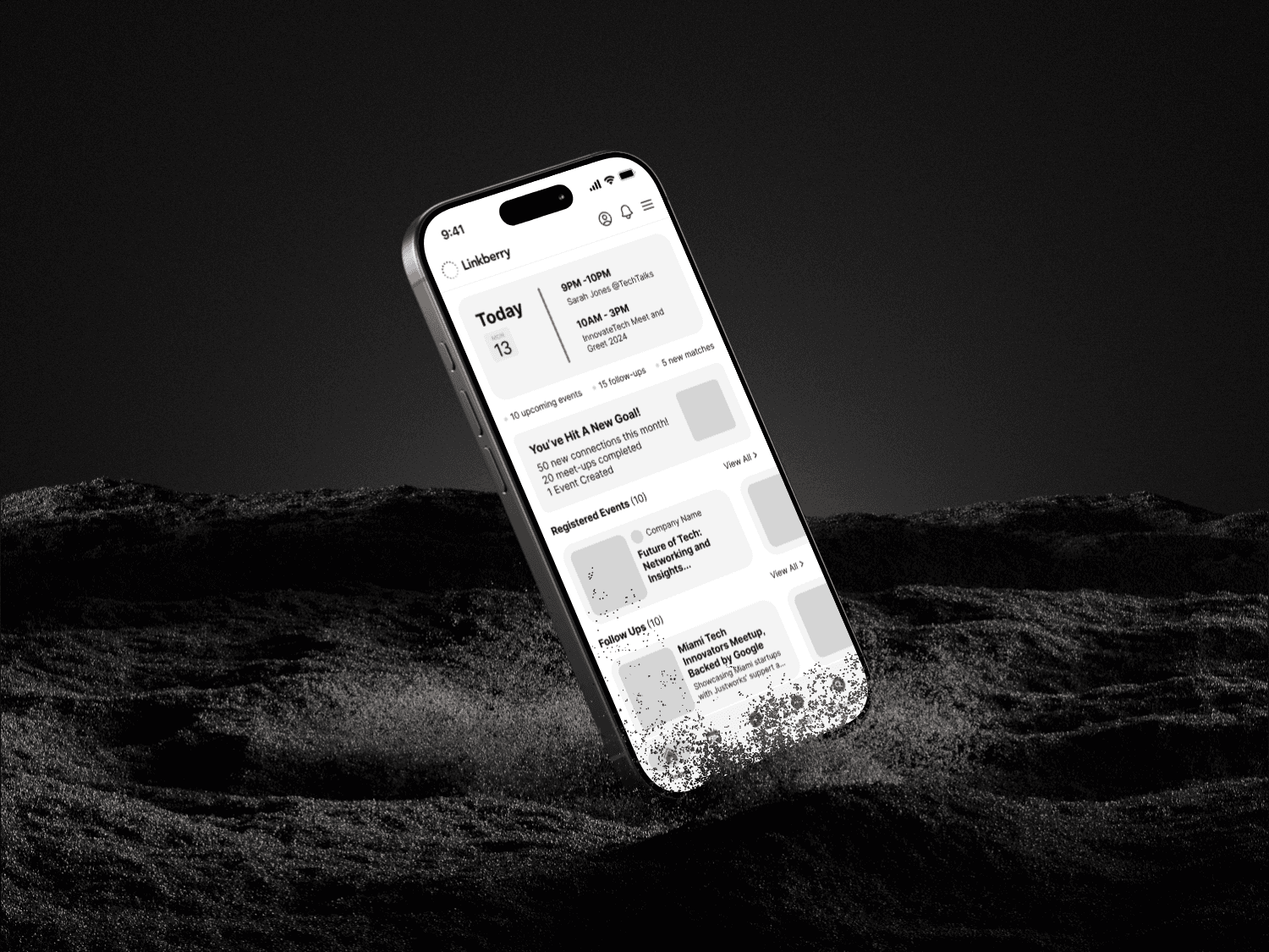
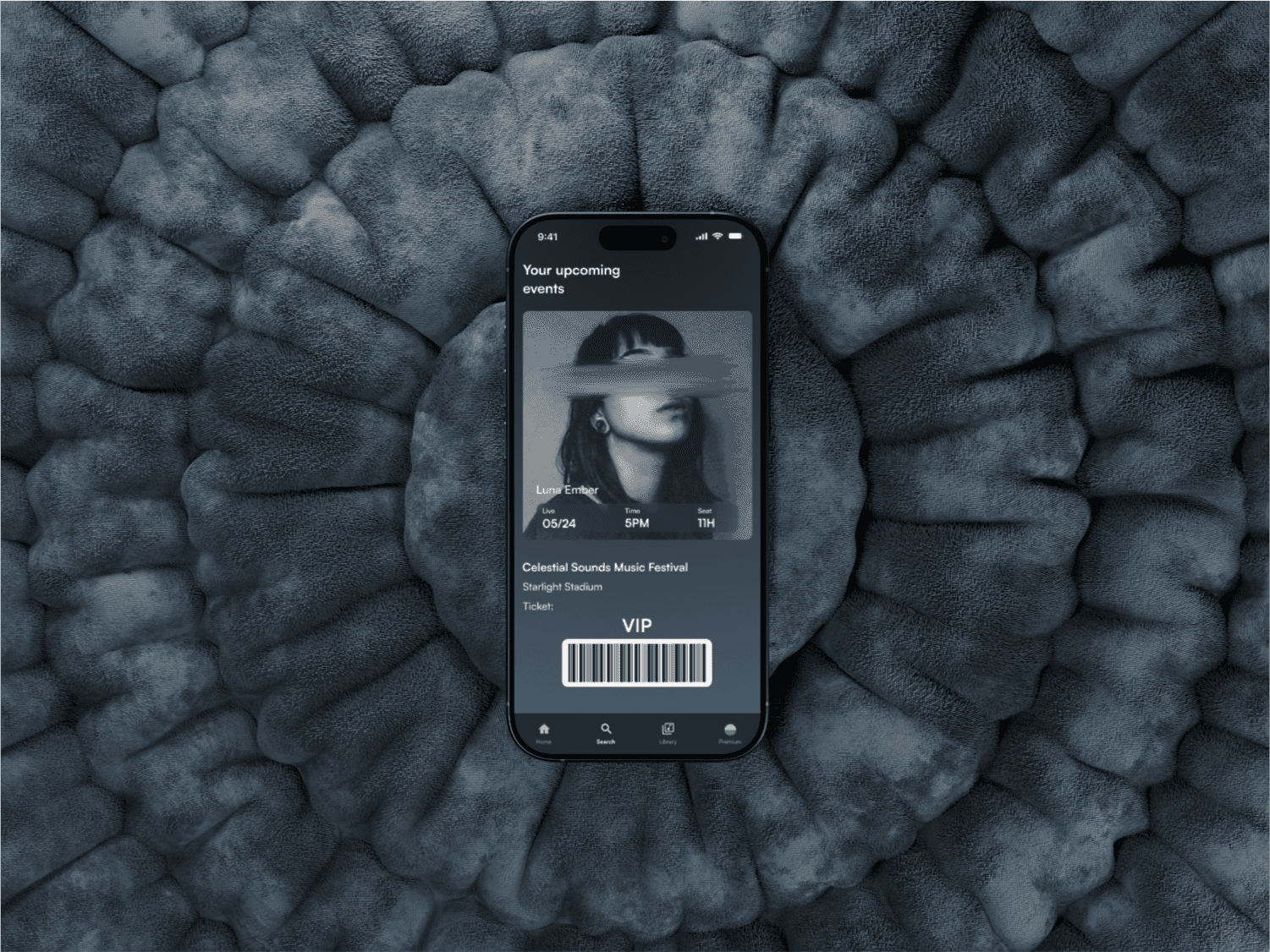
Previous design team's work
My Role
UI/UX Designer responsible for user interviews, wireframes, and prototyping.
Bonus context: Team of four UI/UX designers working closely with client.
Assigned Tasks
Heuristic analysis, user interviews, research synthesis, site maps, user flows, personas, client presentation, wireframes, and high-fidelity prototyping.
Communication
The client initially expected us to build on the previous design team's work, but after we highlighted several critical issues, they approved a complete redesign.
Resolving Complex Problems
Given our time constraints, we worked with the client to focus our research on prioritizing either a mobile or web platform. Based on user feedback, we determined that most users preferred the platform to be hosted on the web.
Conducted user testing and user interviews on the previous design to identify well-liked features and areas for improvement.
Initial research showed that users want two key things: a sense of community and constructive feedback.
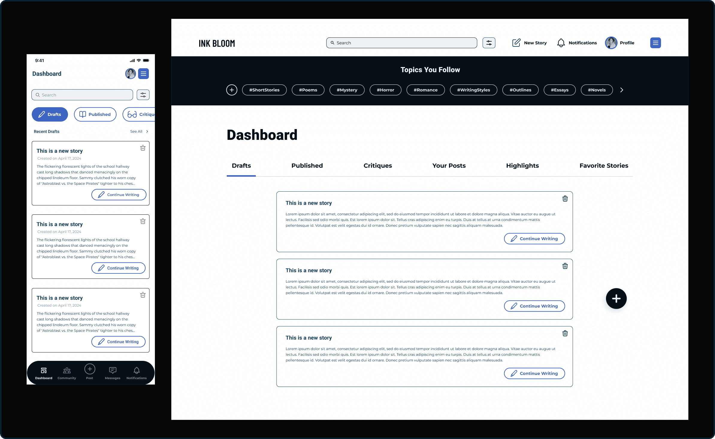
Solution
We needed to develop key features based off initial research.
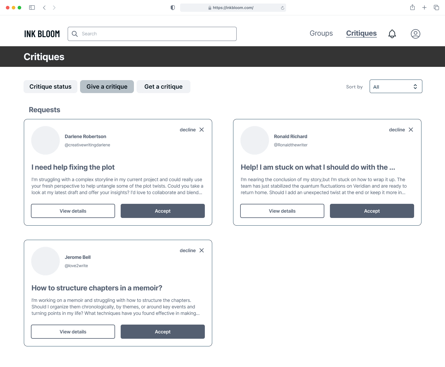
Community
Critique and Feedback
User Profiles (to support community interactions)
Design Methods Employed
Site maps, user flows, sketches, wireframes, style guides, mid-fidelity prototyping, and high-fidelity prototyping.
Accessibility and Optimization
While creating our style guide we made sure it passed for WCAG-AAA compliant.

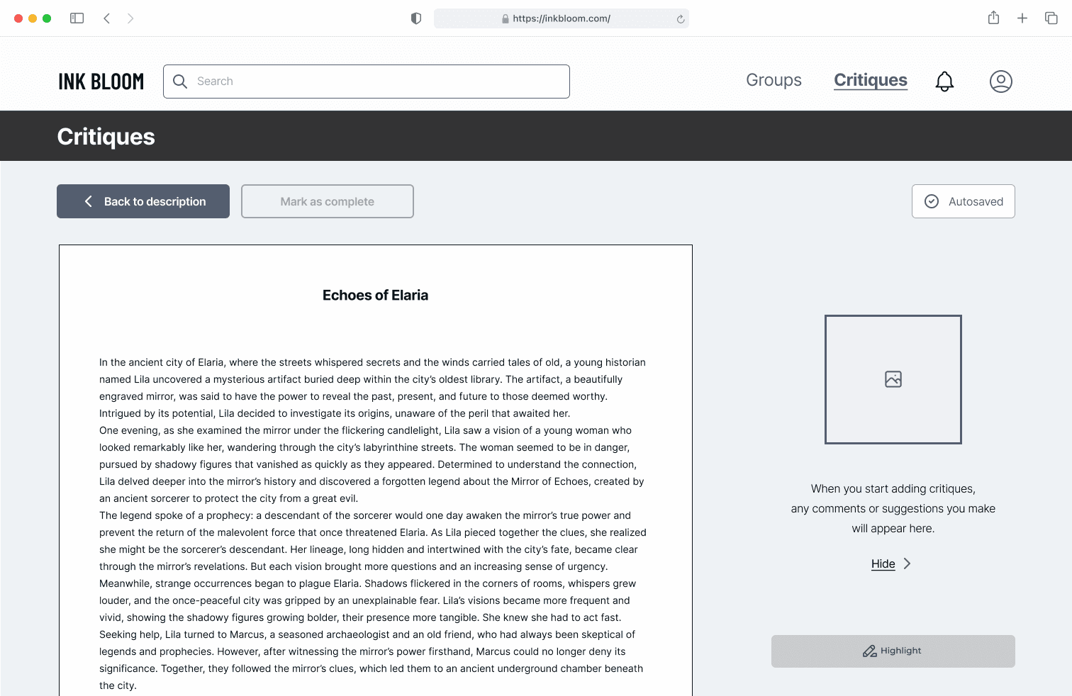
User Testing
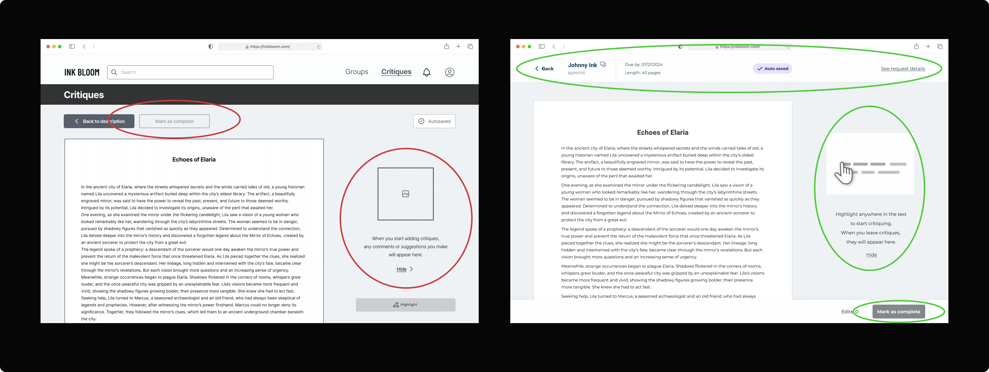
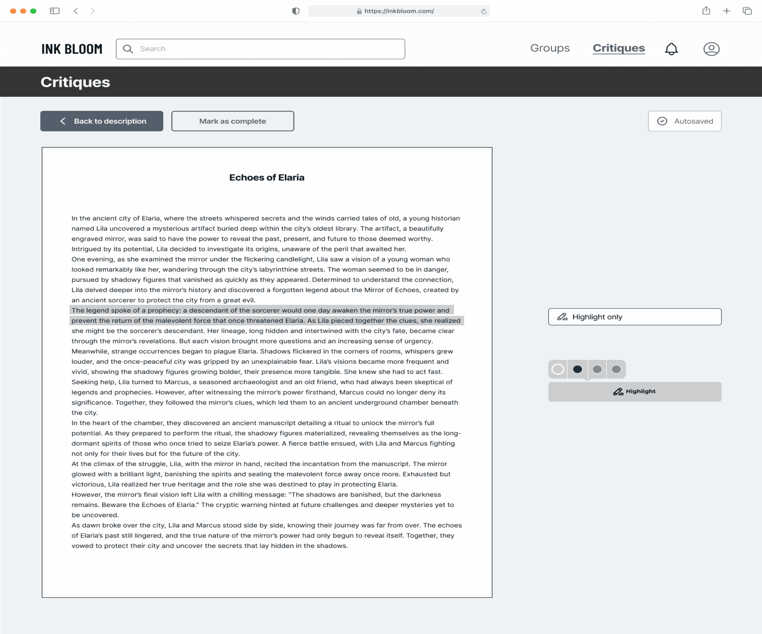
Feedback:
Problems:
Users overlooked the 'Mark as Complete' button.
Users felt unsure about what to do on this page because of the lack of clear instructions.
Solutions:
Consolidated all information in the header, allowing users to focus on the main task below.
Enhanced clarity by using a highlighted illustration.
The 'Mark as Complete' button was relocated to follow the natural reading pattern from top-left to bottom-right, making it more visible and easier for users to find
Client's Message
The client was highly satisfied with the final product and shared a thoughtful message:
"Thank you so much! Your design has truly set a new standard at Ink Bloom. The hard work is evident, and I look forward to the opportunity to work together again someday." – Ray
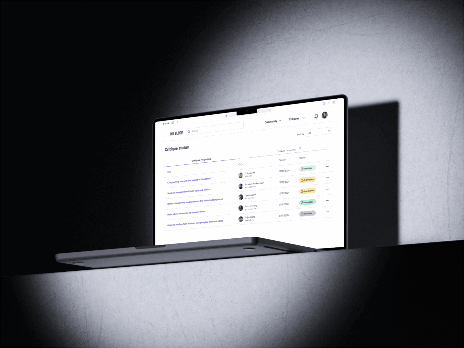
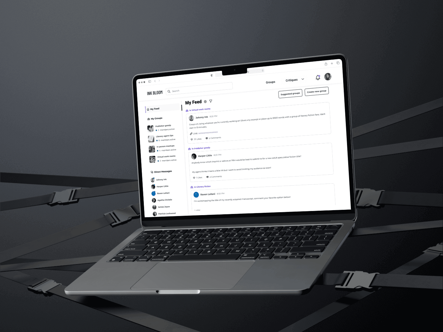
Prototype
Next steps
Explained Missing Critical Features: Outlined essential features required for developer handoff, including:
Onboarding
Payment integration
Setting and content configuration
Iterations on messaging flow
What I learned
I gained valuable experience collaborating with other designers and navigating differing design choices. The key takeaway was the importance of communication; while designers are often passionate about their own approach, there are usually multiple effective solutions. Keeping an open mind is essential.
I also worked directly with the client in this role, where I focused on understanding their expectations, maintaining clear communication, and accurately interpreting feedback. This experience highlighted the importance of aligning design decisions closely with client needs.
Summary
Our initial goal was to refine the existing design for developer handoff. However, the previous design team had assumed users would prefer a mobile platform over web. After testing, we discovered that users favored a web-based platform, shifting our focus to web design.
The client expected web design completion within 28 days. We communicated that this timeline wouldn’t allow for a high-quality outcome, and the client ultimately prioritized quality over speed.
We delivered a high-fidelity prototype with all core features, along with a “next steps” list sent to the client after our final presentation.
Thanks for reading!
(P.S. Keep scrolling for more!)